Student experience is rightly a high priority for universities at present, but the tendency is to focus on the metrics and trying to work out how to improve them. Data will give you an account of where there are deficiencies but to achieve excellence you need to look at every aspect of how staff and students experience the university, and how you can improve each one. Then, as Bill Walsh said, “the score will take care of itself”.
A key principle of user experience (UX) is to stop asking “does it work?” and instead focus on how we can make it work in the most intuitive and supportive way for all users. My go-to example for students when demonstrating this was a particular digital remote control where, if you were fast-forwarding, when you pressed play it jumped back a calculated amount. This meant you could fast-forward past the adverts, hit play and it would jump back so you didn’t miss the start of the programme – no stopping too soon or overshooting. It didn’t just work, it made the process easier.
- Boosting student retention rates online
- Building community in the classroom whatever your teaching modality
- Creating a welcoming and inclusive online learning community
Identify “user” tasks
The first step is to identify the tasks your user is trying to complete. For instance, if a student is right at the start of their degree registering for their course, you might also want to think about all the other tasks they need to do and signpost them to where and how to do them. You could provide links to these things in your registration pages or, even better, create a single “what you need to do to get started” app that takes students through everything they need to do and then they can check them off. You could also build in functionality that enables you to see what students have and haven’t done, enabling you to push out support if they might need it. Reassuring them that they are doing all the right things is bound to be helpful, which leads us on to another technique:
Who are the “users”?
A first-generation student starting university will have a very different response to their first day than someone whose elder siblings or parents have all attended a university. Different again will be a part-time mature student who has taken valuable time off work to be there. Once you know your different types of users, you then need to understand their specific wishes and requirements, as each will respond differently in each of the tasks.
Empathy mapping
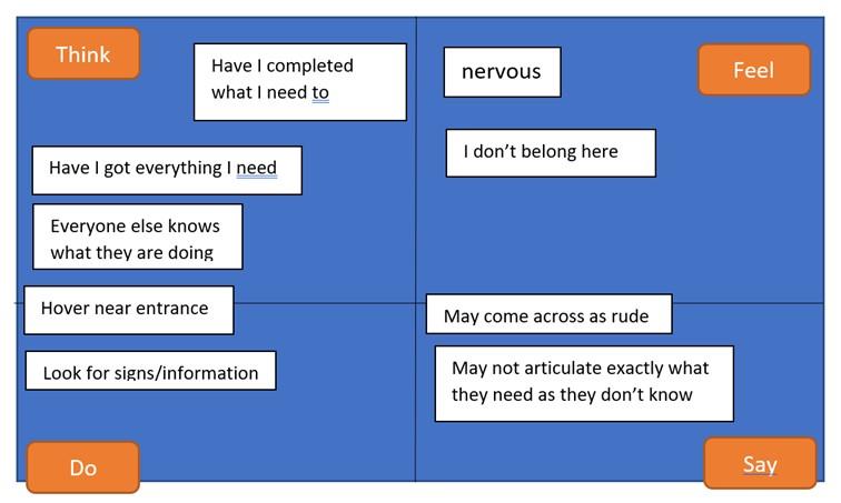
The idea here is to understand that you are not the user and try to put yourself in their shoes – what might your users be thinking and feeling? What might they say and do? This can be very helpful in seeing how you can go that extra step to support them. A basic initial empathy map for a new student who is the first in their family to attend university, might look like this:

You would need to do this for all your user types and then look at how you can apply this knowledge to better support them. Using all this information you can enrich the task description for each user by creating scenarios of use – these are simple stories that describe what it is that your user is trying to achieve and give a richer narrative for people to engage with.
Even in this quick example, there are some clear support actions:
“I don’t belong here”: you could help alleviate this by having student profiles of people from similar backgrounds clearly on display in institutional materials on and offline, course content and more. Have a range of student helpers greeting the new students so they can speak to someone who understands their situation – this also helps the “hovering by the entrance”.
“Have I got/completed everything”: have a checklist on prominent display throughout fresher’s week.
The more effort you put into really understanding your students and staff, creating systems and processes that truly work for them and demonstrating that they are a valued individual, the more you are supporting them. Creating a much more supportive and inclusive culture will pay dividends – and the scores will take care of themselves.
Kevin Curtis is portfolio and student experience lead at the University of Portsmouth.
If you found this interesting and want advice and insight from academics and university staff delivered directly to your inbox each week, sign up for the THE Campus newsletter.


comment